 Interiors
Color in a North-Facing Room
North light is steady, cool and unflattering to about half the paint colors ever sold. Here is how to choose for it instead of fighting it.
A north-facing room receives no direct sun at any hour of any day. What comes through the window is light from the sky itself, reflected off whatever is opposite, and it has two qualities that decide everything about the room: it is cool, and it is remarkably steady.
Most clients describe such a room as dark. It usually is not. Measured, a north room at midday is often brighter than a south room with the blinds half drawn. What it is, is cold — and cold reads as gloomy long before it reads as dim.
What north light actually does to a color
Skylight is weighted toward the blue end. Every color in the room is lit by it, and the effect is not uniform.
- Warm colors lose their warmth. A yellow-based cream goes green. A pink goes gray. A warm white goes flat.
- Cool colors get colder. A pale blue that looked restful in the store reads as clinical by the second day.
- Low-chroma colors give up. Greige, in particular, has nothing left to hold onto and collapses into nothing at all.
- Saturated colors hold. This is the finding that surprises people: the deeper and more pigmented the color, the better it survives.
That last point is the one worth building on.
Why depth works and pallor does not
A pale color is mostly white base, and white base does exactly one thing: it reflects whatever light is falling on it. In a north room that light is blue, so the wall is blue, whatever the chip said. A saturated color has enough pigment of its own to assert something against the light rather than simply passing it along.
The instinct in a cold room is to lighten it. Almost every time, the fix is to deepen it instead — and to stop asking the walls to do the work of a lamp.
A method that works
- Read the window first. Stand in the room at ten in the morning and again at four. Note what is opposite: a brick wall throws warm light back, a white render throws cold, a tree throws green for half the year.
- Test at scale. Two coats on a two-foot square of primed board, not a chip, and never straight onto the existing wall — the old color bleeds into your judgment.
- Move the board. Against the window wall, on the wall opposite, and in the darkest corner. A north room has more internal variation than a south one, not less.
- Look at night. The room will be under lamplight for a good share of its use, and a color chosen only in daylight often has an unpleasant second life after dark.
- Live with it for a week. Undertone is something you notice on day four, not day one.
What to put on the walls
Three directions hold up reliably in north light.
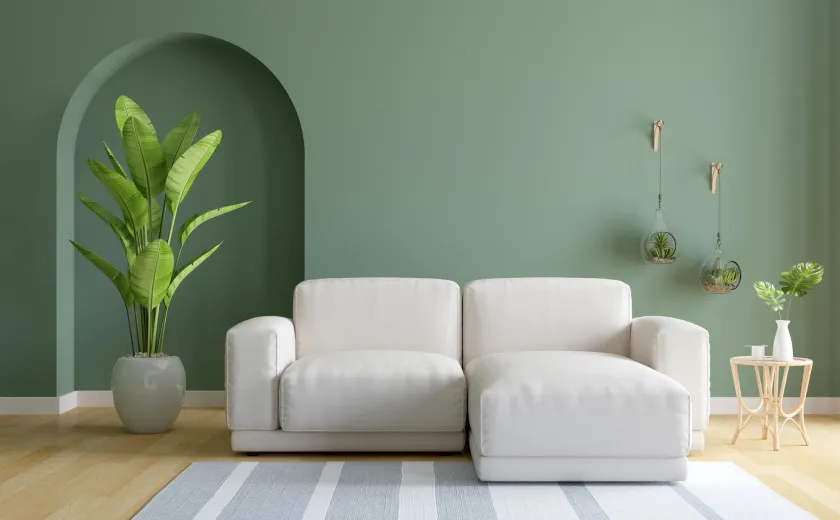
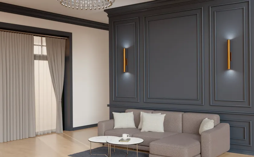
Deep, slightly green-leaning colors — olive, bay, a muddy sage — do well because the light is already pushing them that way and they have somewhere to go. Warm mid-tones with visible red in them, clay and terracotta and a browned pink, buy back the warmth the light takes out. And genuine dark colors, at the point where the wall stops being a color and becomes a surround, sidestep the problem entirely: a room that is frankly dark is comfortable in a way that a room failing to be bright never is.
What does not work is the pale warm white everyone reaches for. It is the single most common paint decision in a north room and it is wrong almost every time.
The part that is not paint
No color choice fixes a room lit by one fitting in the middle of the ceiling. North light is constant, which means it never gives you the moment of warmth that a west-facing room gets for free at six o’clock. That moment has to be built: two or three lamps at table height, warm lamps, on their own switch, so the room can change character in the evening.
Get the light right and the color choice becomes much less delicate. Get it wrong and no color on the fan deck will rescue it.