


 Design Trends
Quiet Color Is Back
After a decade of gray and greige, the palette has moved toward complex, slightly muddy colors with real pigment in them. Here is how to use one without repainting in a year.
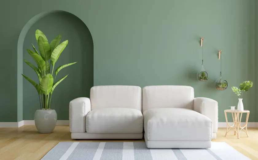
The gray decade is over. What has replaced it is not the saturated brights that usually follow a neutral period, but something more interesting: complex, low-chroma colors with visible pigment and a slightly muddy quality. Olive, clay, faded plaster pink, a blue-green that cannot decide, a brown that is nearly purple.
These colors are considerably easier to live with than either gray or a clean bright, and considerably harder to choose.
What makes a color complex
A simple color is made from few pigments. A complex one is made from several, including some that pull in opposite directions, which is what gives it the quality of shifting as the light changes. The same clay pink can read warm and dusty at eight in the morning and almost lilac at six in the evening.
That instability is the appeal. A room painted in a complex color is never quite the same room twice, which means you do not tire of it the way you tire of a flat, single-note shade.
Why they work better than brights
- They have enough pigment to feel like a decision, which gray never does
- They have enough gray in them to sit under whatever furniture you already own
- They do not date to a specific year the way a clean saturated color does
- They flatter skin, which most cool brights do not
How to choose one without regret
The sampling discipline matters more here than with a neutral, because the shift across the day is larger. Paint two feet square on at least two walls, put two coats on, and live with it for a week. Look at it in the morning, at midday, in late afternoon and under your lamps.
Then look at it against the things in the room that are not changing: the floor, the counter, the fireplace, the big rug. A complex color takes a great deal of its character from what is reflecting into it, which is precisely why it cannot be chosen in a store.
Three colors used across a whole house will look more considered than twelve used bravely in one room. The restraint is what makes the pigment read as confidence rather than as an experiment.
The ceiling question
The single move that separates a considered scheme from a nervous one is taking the color onto the ceiling. In a room with a strong color on the walls, a white ceiling draws a hard bright line at the top of every wall and makes the room feel lower, not taller.
Color on the ceiling, in the same shade or a slightly lighter version of it, makes the edges disappear. It is the decision clients query most often before installation and defend most vigorously afterward.
Where it goes wrong
Complex colors fail in rooms with poor light and nothing else going on. They need either daylight or a decent lamp scheme to reveal what is in them. In a dark hallway lit by a single overhead fitting, an olive reads as sludge.
They also fail when paired with a trim white of the wrong undertone. Pick the trim color from the same family, or take the trim in the wall color at a higher sheen, which is currently the most reliable move available.
The sustainability footnote
Choosing a color you will keep is a sustainability decision, even if it does not feel like one. Repainting a house consumes material, generates waste and produces emissions that no low-VOC formulation offsets. The complex, low-chroma palette has a much longer tolerance in practice than either gray or a bright, which is a quiet argument in its favor.
Get it right, on your own walls, over a week. Then leave it for ten years.